
State eCommerce
Utah eCommerce Web Design (UT)
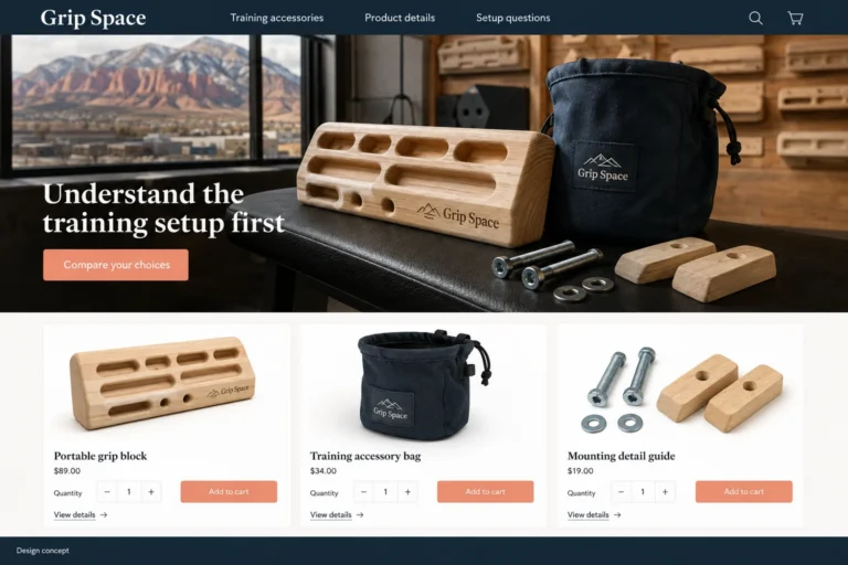
A home training-space idea needs a careful brief before it needs a shopping basket.
Explore this designPractical ideas. Clear next steps.
See what your customers need from a website, explore an example design, and prepare a brief for your own business.
Industry guides focus on a particular buying journey. State ecommerce guides explore a hypothetical local store and the decisions behind its design. The illustrated stores and businesses are fictional concepts.
State eCommerce
A home training-space idea needs a careful brief before it needs a shopping basket.
Explore this design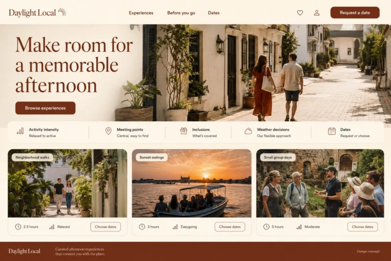
Food & Hospitality
Travelers often compare experiences while fitting several plans into one day.
Explore this design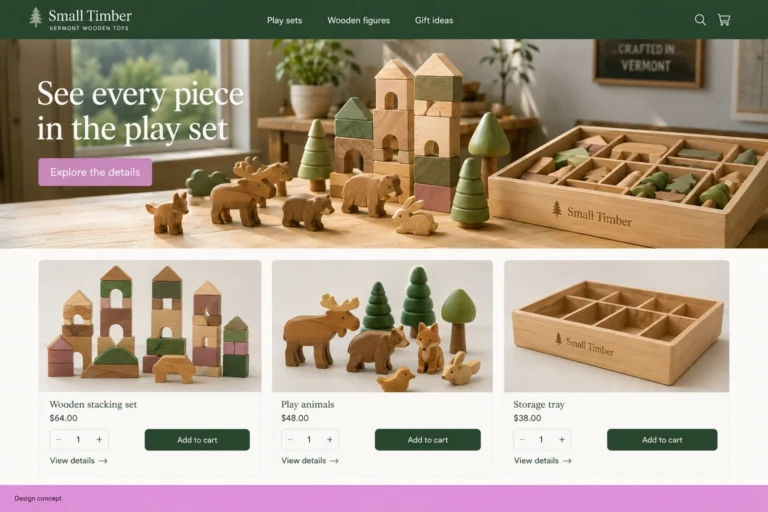
State eCommerce
A toy gift is easier to choose when the buyer knows exactly what the recipient will open.
Explore this design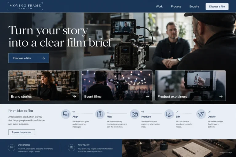
Professional & Creative Services
A good video portfolio shows more than attractive shots.
Explore this design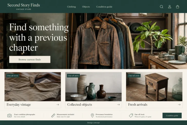
Retail & eCommerce
A vintage website sells particular objects, not interchangeable catalog stock.
Explore this design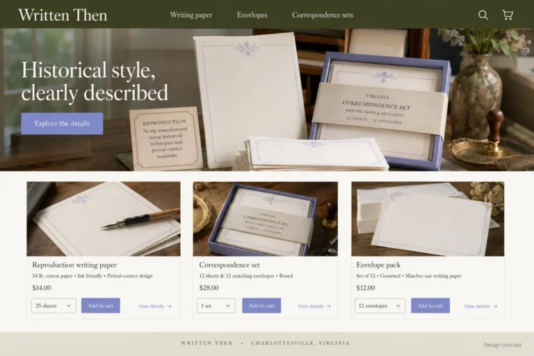
State eCommerce
A writing gift can feel personal without being complicated.
Explore this design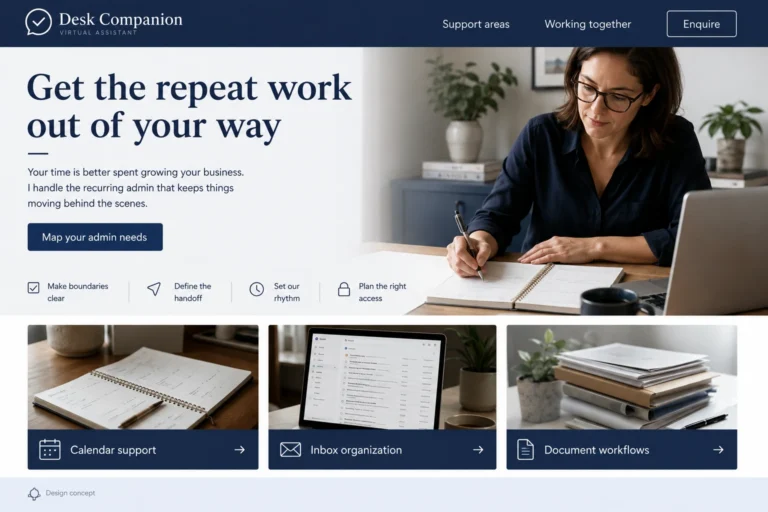
Professional & Creative Services
Someone considering a virtual assistant often needs help defining the work before they can hand it over.
Explore this design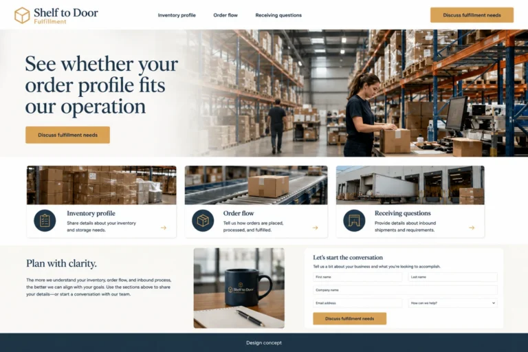
Automotive & Transport
A fulfillment website should explain what kinds of inventory and order patterns the operation handles.
Explore this design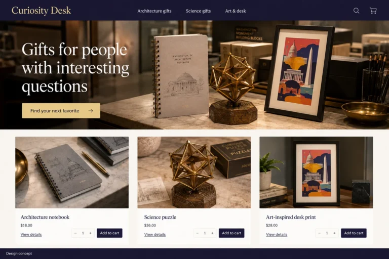
State eCommerce
Choosing a colleague's gift often means knowing one interest and little else.
Explore this design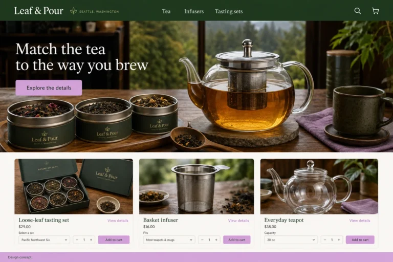
State eCommerce
A tea tasting set can help a customer explore unfamiliar flavors without choosing a large package of one blend.
Explore this design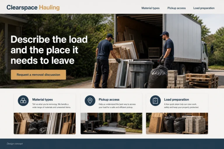
Property & Commercial Services
Help customers describe what needs removing and understand the steps before a collection is accepted and scheduled.
Explore this design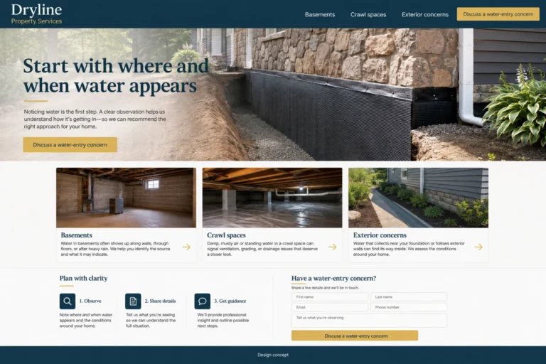
Construction & Home Services
A waterproofing website can ask whether the concern involves a basement, crawl space, or another accepted area.
Explore this design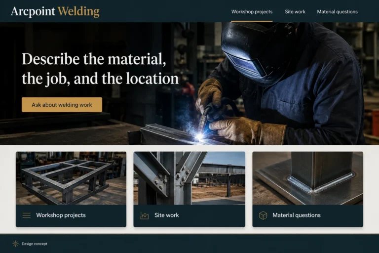
Manufacturing & Agriculture
A welding website should let someone explain what they have, what they want done, and where the item is located.
Explore this design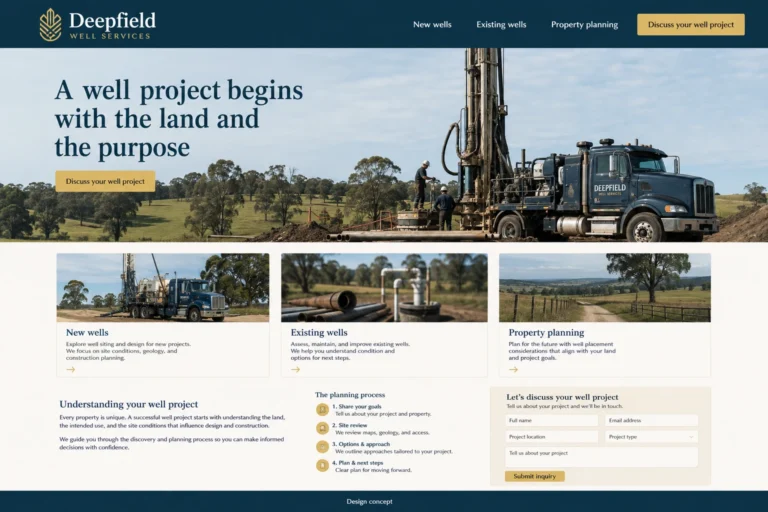
Construction & Home Services
A well-services website should help an owner explain where the land is, what the water supply is intended to support, and whether a well already exists.
Explore this design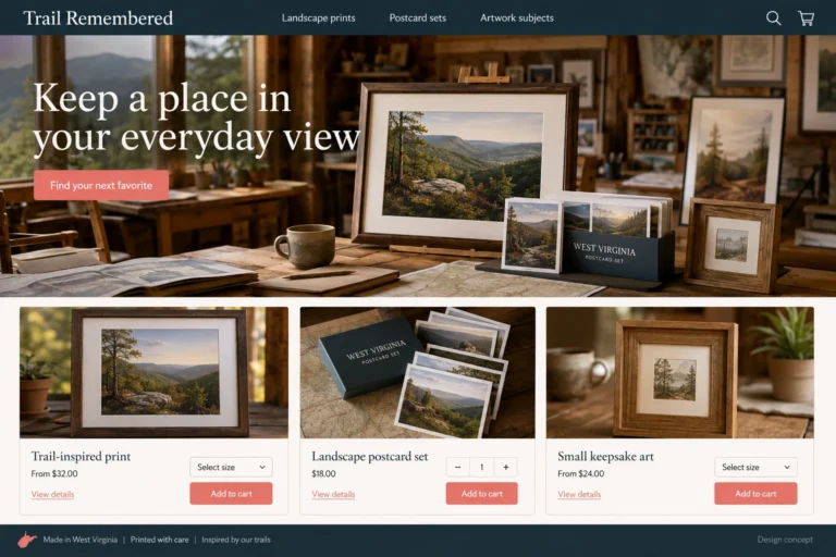
State eCommerce
A souvenir gift can be more thoughtful when the buyer recognizes the place or visual detail it recalls.
Explore this design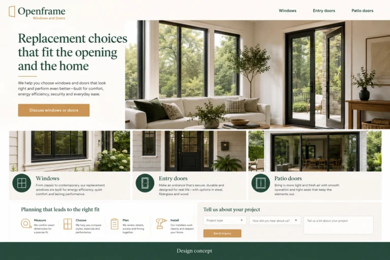
Construction & Home Services
A visitor considering a new front door has different priorities from someone replacing several windows.
Explore this design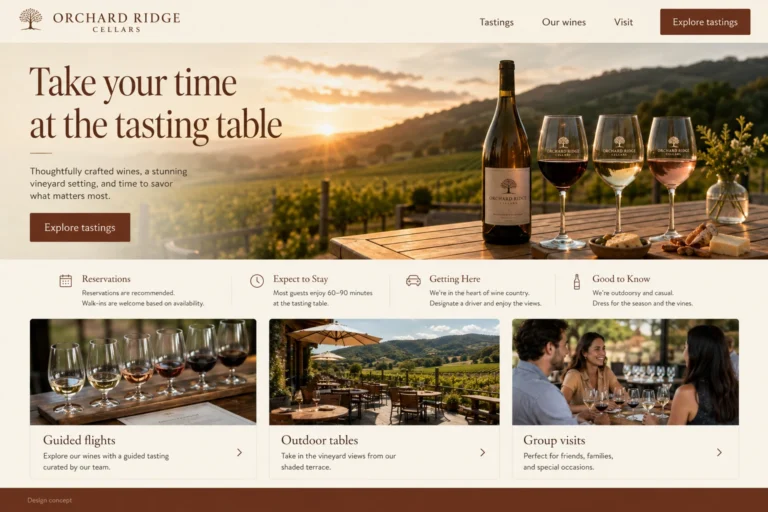
Food & Hospitality
A winery website should help someone plan the afternoon, not just admire the landscape.
Explore this design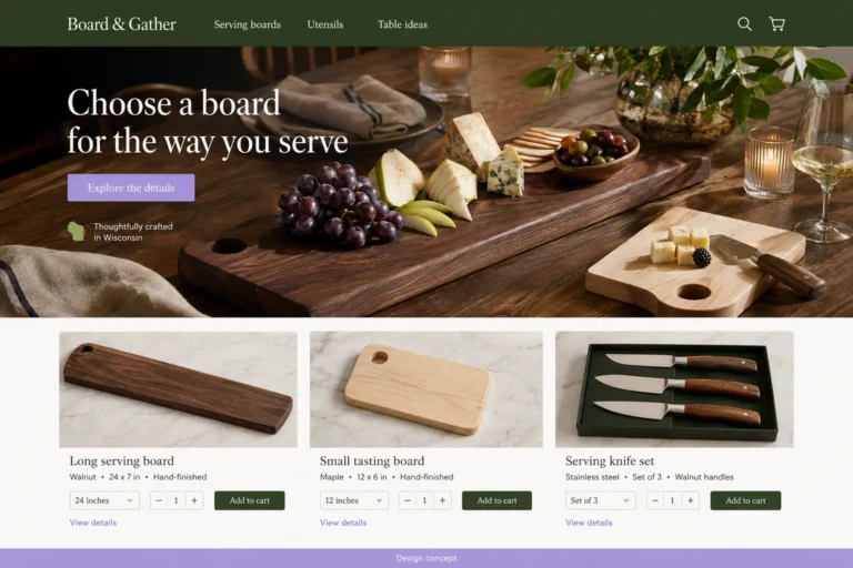
State eCommerce
Hosting tools are easier to choose when the website shows the job each one performs.
Explore this designAn auto body website should explain how a customer moves from a damage inquiry to the next shop conversation.
A detailing website should let a driver explain whether the main concern is the interior, the exterior, or a particular area they want reviewed.
A useful repair-shop website offers a route for scheduled care and another for a vehicle concern.
A marine-service website should identify the kinds of vessels and work the business handles.
A courier website should help a customer describe what is moving and the journey it needs to make.
A fleet-service website should help a manager describe the vehicles, their work pattern, and the support being considered.
A freight-broker site should explain what the business coordinates and how a shipper starts a discussion.
A mobile-mechanic site should explain how the business reviews the vehicle, requested work, and place where the visit would occur.
Motorcycle website design should show which bikes and service requests the business handles.
A moving website should help a customer explain where they are going, what they are moving, and which services they want to discuss.
An RV website should make the distinction between vehicle categories and offered work obvious.
A tire website should accommodate someone researching options and someone ready to ask about an installation.
A towing website should make it easy to reach the business and explain what information helps it respond.
A trucking website should show where the company operates, the equipment it uses, and the freight it accepts.
A fulfillment website should explain what kinds of inventory and order patterns the operation handles.
A cramped vanity, limited storage, or an awkward shower entrance is a stronger starting point than a generic promise of luxury.
Visitors often know they want a new patio or replacement driveway but have little vocabulary for the work.
Construction customers often arrive with a rough idea rather than a finished specification.
A deck website can organize projects around outdoor dining, a small seating area, or a route from the house to the garden.
An electrical website should make it easy to say, "I am planning new work" or "I need someone to assess an existing issue." These paths require different explanations and should not disappear inside one long list of services..
A fencing website can start with three questions: what should the fence do, what should it look like, and where must people move through it? Those decisions provide a more useful browsing experience than a long material list..
A flooring website can group examples by family rooms, workspaces, and frequently used entry areas.
A foundation-services website should explain how to request a review without using alarming imagery or certainty that the available evidence cannot support.
Someone with a garage door that is not behaving normally needs a contact route.
A useful gutter website lets visitors choose routine cleaning, an observed problem, or planned replacement.
A remodeling homepage can speak to cramped circulation, unused rooms, or a house that no longer suits daily life.
A useful HVAC homepage offers plain choices: solve a current problem, consider a new system, or discuss ongoing care.
An insulation website can begin with the part of the home involved and what prompted the inquiry.
Someone comparing kitchen remodelers needs to see more than attractive counters.
Beautiful garden photography becomes more useful when readers can see how the space supports everyday life.
A lawn-care website should help an owner picture an ordinary service visit.
Brick, block, and stone projects can look very different to a customer.
A painting customer needs to know which surfaces and property types the company handles.
Customers may recognize droppings, damage, or recurring activity without knowing the cause.
A plumbing website needs a readable contact action, a clear location statement, and an honest account of availability.
A pool site can organize examples around family swimming, exercise, or an outdoor gathering space.
A pool-care website should show customers what regular attention looks like in the business's own process.
An exterior-cleaning website should help visitors identify what needs attention and what it is made from.
Roofing navigation works best when people can choose a current problem, planned replacement, or general assessment.
Many septic customers cannot provide a model or exact layout.
Solar website content should explain why a project starts with the building and the owner's needs.
People may arrive because branches are close to a roof, a stump occupies the yard, or a tree looks different than before.
A waterproofing website can ask whether the concern involves a basement, crawl space, or another accepted area.
A well-services website should help an owner explain where the land is, what the water supply is intended to support, and whether a well already exists.
A visitor considering a new front door has different priorities from someone replacing several windows.
A visitor meeting an animal through a website needs more than a appealing photograph.
Someone browsing an art workshop may be wondering whether they need experience, what they will use, and whether the finished work can go home that day.
A beginner looking at coding classes may not know the difference between learning a language, building a small project, and becoming ready for professional work.
A community center may offer many different activities, but residents usually arrive looking for one suitable thing to do.
A theater website can celebrate the energy of a production while answering the practical questions that get someone into a seat.
A dance studio may feel welcoming in person while its timetable feels mysterious online.
Choosing a language class can be difficult when every course title sounds promising but says little about the learner's starting point.
Library visitors arrive with very different tasks: find a specific title, join for the first time, use a digital resource, or attend an event.
A museum's website serves people planning a visit and people discovering the collection from elsewhere.
Someone considering music lessons is often making a first practical commitment to an interest.
A nonprofit's website has several jobs at once: explain the mission, help people find programs, and make participation possible.
Caregivers visiting a preschool website are trying to imagine an unfamiliar place becoming part of their child's routine.
Families choosing a school need more than a statement of values.
People looking for tutoring may know exactly which topic is difficult, or they may only know that learning has become frustrating.
For a family new to a sports club, the practical questions can be more pressing than the results on the homepage.
The best bakery websites make a visitor hungry and then help them plan.
A bed and breakfast website can make a guest feel familiar with the house before they arrive.
A guest may discover a boutique hotel through one striking photograph, but a reservation requires more than a mood.
People planning a brewery visit need more than a logo and a row of cans.
Your cafe website should be useful before the first sip.
Before a camper falls in love with the view, they need to know whether their tent, trailer, or travel plans fit the campground.
Someone hiring a caterer may be planning their first event.
Most people do not arrive at a coffee store thinking in processing methods or tasting-score language.
People choosing an event venue are trying to imagine a day that does not exist yet.
A food truck website has to keep up with the truck.
A meal prep website needs to answer a calendar question as much as a menu question.
Think of a restaurant homepage as the host's first conversation with a guest.
Buying tea online can feel surprisingly uncertain.
Travelers often compare experiences while fitting several plans into one day.
A winery website should help someone plan the afternoon, not just admire the landscape.
An agricultural-equipment website should help customers explain what they want to accomplish before asking them to compare models.
A supplier website should connect clear product categories with accurate specifications and the next ordering step.
An electronics-assembly website should show where the business enters a customer's project.
A rental website should offer a route for someone who knows the equipment name and another for someone who only knows the task.
A farm website should make clear what is offered, how to buy it, and where the handoff happens.
A grain-and-feed website should show accurate product names, formats, and units.
The word greenhouse can mean different things to a visitor.
An industrial-repair website should show the machinery and work the business actually accepts.
An irrigation website should begin with the property and the reason for contact.
Machine-shop website design should connect real processes and materials to the kinds of parts the business discusses.
A fabrication website should show what the business makes and which parts of a project it handles.
A packaging website should start with the product and the intended use of the pack.
A nursery site should connect plant browsing with the actual stock, sizes, and buying arrangements.
A plastics website should distinguish a new part concept, a developed design, and an existing product seeking another production arrangement.
A welding website should let someone explain what they have, what they want done, and where the item is located.
A regular customer may open the site with one thumb and want the same barber as last time.
Someone arranging an afternoon for themselves has different questions from someone buying a birthday gift or organizing a shared visit.
A dog owner may arrive at a training website worried about a specific everyday problem.
Someone visiting a salon for the first time may feel less certain about the appointment than about the hairstyle.
A massage studio's most useful website content may be an ordinary explanation of the first visit.
Many nail salon guests arrive with a saved photograph.
Someone considering a trainer may not be ready to buy a package on their first visit.
Before arranging grooming, an owner may want to know where their pet will go, how the appointment is organized, and what the service includes.
A first-time Pilates visitor may recognize the equipment but still have no idea which appointment to select.
A yoga studio timetable is often the most useful part of its website.
A consulting website earns attention when a business owner recognizes their own problem in the description.
Clients reading a copywriter's website are already experiencing the writer's work.
Event planning can mean very different things to different buyers.
A designer's portfolio becomes more persuasive when visitors understand the decisions behind it.
A room photograph can show an interior designer's taste, but a client also needs to understand how that room came together.
A person looking for an IT partner and a customer reporting an issue are trying to do different things.
Businesses comparing marketing agencies need more than a menu of familiar channel names.
People hire a photographer partly because they like the images and partly because they can picture themselves in the process.
A host may arrive with a show idea, a folder of recordings, or a production routine that has become difficult to manage.
Someone hiring a PR firm may have a story they care about but little understanding of the work needed to communicate it.
A studio website should make it easier for an artist to imagine working in the room.
Businesses often approach a software consultancy knowing what is frustrating but not what should be built.
People seeking translation often begin with a file and a deadline.
A good video portfolio shows more than attractive shots.
Someone considering a virtual assistant often needs help defining the work before they can hand it over.
Help architecture clients see how a practice thinks, understand its scope, and bring better questions to the first meeting.
Make commercial cleaning project requests more precise through clear job types, scope examples, and practical site questions.
Use project roles, readable service descriptions, and a focused inquiry route to make an engineering consultancy easier to evaluate.
Help inspection customers understand the report, the booking steps, and the boundaries of the service before they request a date.
Help facilities teams compare ongoing janitorial arrangements, understand communication, and prepare for a site-specific proposal.
Make a surveying firm's services understandable through project purposes, clear deliverables, and a practical inquiry form.
Help customers reach the right locksmith service with accurate hours, clear job categories, and realistic expectations for the first call.
Make portable restroom rental requests clearer through equipment comparisons, complete dates, and practical delivery questions.
Make a property management website useful to owners and residents without mixing sales, leasing, and service requests.
Build a brokerage website that connects a property search, an agent introduction, and a useful first inquiry.
Build a restoration website around clear availability, accurate service scope, and a straightforward handoff to the company's team.
Help customers compare an installer's real services and understand what belongs in a site consultation rather than a public inquiry.
Build a storage website that explains unit choices, the move-in process, and the difference between checking availability and renting.
Turn a sign idea into a workable inquiry through useful examples, dimension prompts, and a clear artwork-review process.
Help customers describe what needs removing and understand the steps before a collection is accepted and scheduled.
An artist looking for a particular paper and a beginner choosing their first paints need different amounts of guidance.
Beauty shopping online works better when the details behind the image are easy to find.
A bookstore's website should feel like a place where someone can both find a known title and discover an unexpected one.
A boutique's taste is part of what customers come for.
Flowers are often ordered for a moment that matters to someone else.
Someone can love a chair or table and still hesitate to buy because they cannot tell whether it fits through the doorway.
A gift-shop visitor may know almost nothing about the item they will buy.
A handmade shop can invite customers into the maker's world while still giving them a straightforward buying experience.
The most exciting photograph in a model shop may show a completed scene, while the product for sale is only one part of it.
A home decor website works best when customers can move easily from liking a room image to understanding a particular object.
A jewelry website needs to make small details feel clear.
Musicians often come to an instrument website with a particular sound, model, or practical need in mind.
A dramatic trail photograph can make outdoor gear appealing, but it cannot tell a shopper whether a pack holds what they need or whether a tent fits the space they have in mind.
Pet supply shopping often mixes a quick restock with a more considered choice.
Buying shoes online asks a customer to make a physical judgment through a screen.
Specialty food shopping often starts with curiosity.
The parent buying equipment for a first season and the player replacing a familiar item should both feel comfortable in a sporting goods store online.
The excitement of a subscription box comes from anticipation, but the purchase should not depend on uncertainty.
A toy-store website should help an adult imagine the play, not just admire a colorful box.
A vintage website sells particular objects, not interchangeable catalog stock.
Choosing pottery for somebody else can feel risky.
An Alaska-inspired outdoor storefront can be useful before anybody clicks Add to cart.
For an Arizona-inspired shade business, the most useful call to action may be Start with your patio.
A first garden shopping trip can end with too many packets and no clear plan.
Imagine opening a refill store for the first time and seeing bottles, pouches, and pumps that all look related.
A commuter opening a bike shop website may have a simple goal: carry a work bag without balancing it on a shoulder.
A book club choosing its next title has different questions from a reader buying one paperback.
Returning to a linen supplier should not require rebuilding the same property order from memory.
The easiest aquarium purchase is often the one a customer has already researched.
A first sewing project can stall before the first stitch because the shopping list is unclear.
Giving an art print means choosing both an image and a format.
A compact camp kitchen is a small puzzle: the pieces need to perform useful jobs and fit together when packed.
A record shop's personality often comes from the person who says, Try this next.
A small workshop project can require only a few new supplies, yet a large tool catalog makes the choice feel bigger.
Planning a birthday cake can turn a simple purchase into a long list of tools.
A quilter with an unfinished top often needs a different shopping route from someone starting a new kit.
A personalized leather belt can be a thoughtful gift, but guessing the recipient's size is a weak starting point.
A dinner idea can be an inviting way into a pantry shop.
A knitted gift is personal, especially when the buyer is uncertain about size or fabric preferences.
A day-paddle shopping list can become cluttered quickly.
Someone hosting a game night does not necessarily know the names of the games they want.
A custom furniture form should help a customer explain the room, not make them pretend to be a furniture designer.
Buying a plant can lead to a second question: what else is actually needed?
Coordinated event paper can involve invitations, place cards, and thank-you notes with very different quantities.
A first model railway is easier to imagine on a measured board than in an endless product grid.
A photography outing does not always require every lens in the cupboard.
A small collection of toys can be easier to manage than a basket of near-duplicates.
A first miniature-painting station does not need to look like a professional studio.
A trip-reading bundle can be useful even before the route is settled.
A home coffee routine often improves through one well-chosen accessory rather than a complete equipment replacement.
A tile project begins with more than a preferred color.
An entryway full of bags is a specific problem.
A room can change with a few textile choices rather than a complete redesign.
Ordering the same workwear again should be straightforward, even when the team needs a different mix of sizes.
Getting an instrument ready for regular practice may involve a few small accessories rather than a new instrument.
Buying a hat for somebody else can leave the buyer with an appealing style and no reliable size.
A daily bag should be chosen around what goes inside it.
A baking subscription gift involves two people with different jobs: the buyer pays, while the recipient uses the kit.
A small gallery wall can begin with two illustrations and a measured patch of wall.
A small porch may need one comfortable place to sit more than a complete matching set.
A first pair of binoculars is easier to choose when the website begins with how the person expects to use and carry it.
A three-pedal idea can be a useful introduction to effects if the website explains the role of each box.
A useful outdoor cooking station needs places for equipment and preparation, not just an impressive cooker in the center.
A home training-space idea needs a careful brief before it needs a shopping basket.
A toy gift is easier to choose when the buyer knows exactly what the recipient will open.
A writing gift can feel personal without being complicated.
Choosing a colleague's gift often means knowing one interest and little else.
A tea tasting set can help a customer explore unfamiliar flavors without choosing a large package of one blend.
A souvenir gift can be more thoughtful when the buyer recognizes the place or visual detail it recalls.
Hosting tools are easier to choose when the website shows the job each one performs.
A travel journal kit can stay simple: a notebook, a writing tool, and perhaps a pouch.