
State eCommerce
California eCommerce Web Design (CA)
Imagine opening a refill store for the first time and seeing bottles, pouches, and pumps that all look related.
Imagine opening a refill store for the first time and seeing bottles, pouches, and pumps that all look related. A California-inspired storefront can remove that uncertainty with two obvious routes: I need a starter set and I already have a container.
Make the first choice visible
The homepage can introduce those routes using a simple bottle-and-pouch illustration. Each route should lead to a useful collection rather than another promotional page. On the starter side, show the complete package with component labels. On the refill side, ask shoppers to check the container name or version against the compatibility information. Keep a direct catalog link for people who know exactly what they want.
Write labels that survive a quick scan
A shopper reading on a phone may only notice the title, size, and button. Include the product type in the title and avoid using the same photograph for a filled starter bottle and an empty replacement. If several scents are available, make the current selection explicit in the cart. Do not communicate compatibility only through color; readable names and identifiers need to carry that information.
Give repeat buyers a reliable reference
Create a short product-system guide with photographs of the current containers and their matching refills. If the business changes packaging, explain what changed and what did not, based on confirmed product information. Customer accounts or order history may help repeat purchasing, but a visitor should not need to sign in simply to read the guide. The most important details belong on product pages as well.
- Test starter and refill routes separately.
- Display quantity near each purchase control.
- Name replacement parts in everyday language.
- Explain any product-version restrictions.
Judge clarity by the mistakes it prevents
Track product-guide visits, purchases from each route, and support questions about missing components. A reduction in confused orders is more meaningful than extra homepage clicks. This fictional California shop should avoid unsupported claims about waste reduction or universal container compatibility. Those statements require evidence beyond a design concept. The site can still be persuasive by showing a tidy, understandable routine and making every item in the first order clear before the customer pays.
A design concept for California
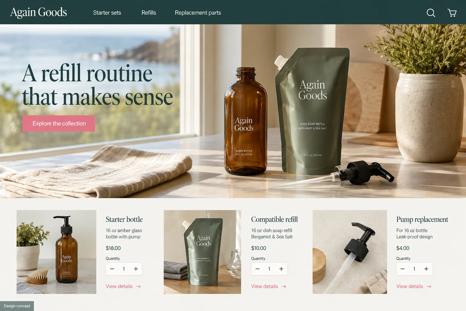
This AI-generated website concept illustrates a fictional business. It is not a completed customer project. Features shown here need to be discussed and scoped for your business.